PRODUCT GRAPHICS
Elevate Your Products with Standout Graphics
Your product deserves to look as good as it performs. Whether it's packaging, labels, or promotional materials, I create graphics that not only capture attention but also reinforce your brand identity. From bold, eye-catching visuals to sleek, minimalist designs, I make sure your product stands out in a crowded market.
THE PROCESS
-
Before designing anything, I take time to understand your product and its market.
What makes your product unique? – Identifying key selling points.
Target audience analysis – Ensuring visuals connect with the right market.
Competitor research – Finding ways to differentiate your product.
-
This is where ideas start taking shape—literally.
Rough sketches – Exploring different design directions.
Typography & iconography – Establishing a cohesive look.
Color palette selection – Setting the right tone for your product’s visual identity.
-
Bringing the best concepts to life with real-world applications.
Detailed graphic design & illustration – Ensuring the visuals are engaging and functional.
Mockups for review – Showcasing how the design translates onto packaging or products.
Client feedback & revisions – Fine-tuning based on input before final approval.
-
Once everything is approved, I prepare final assets for use.
Print-ready files – High-resolution PDFs, AI, and EPS files.
Digital adaptations – Optimized versions for online use.
Production coordination – Assisting with printers or manufacturers if needed.
FEATURED PROJECT EXAMPLE
Understanding the Brand
& Audience
Hive & Mind is a wellness company, they only use ingredients researched, sourced, and tested by them, so they trust our final product and their customers can too. With this in mind, I wanted to create something clean like their products.


Concept Development & Sketching
I wanted the colors to really sing on these labels, so I focused on the small design elements. These were also going to be smaller labels, which meant not only does it need to have white space, it also needed to have large elements for legibility.


Mockups & Refinements
Patterns were a big element that I wanted to play with in these designs. They’re more subtle and they can be used on their site as well as on other packaging designs.


Finalizations & Deliverables
In the final rounds, I focused on using white space and allowing the colors to shine through. Ultimately decided that a pattern on this small of packaging would be muddied.
I’m very pleased with where the labels ended up. If you’re interested in the real deal, check out their website: www.hiveandmind.com


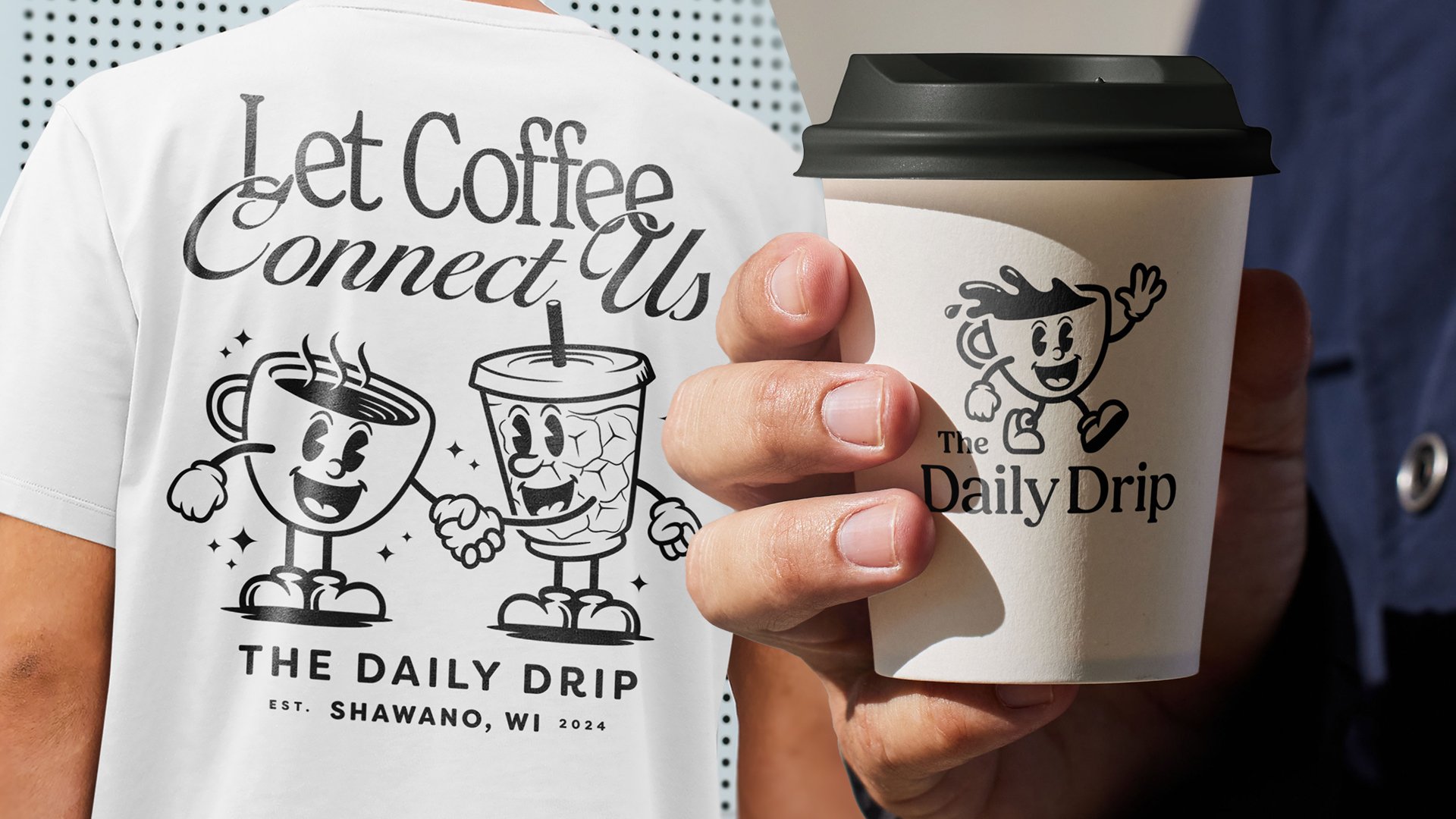
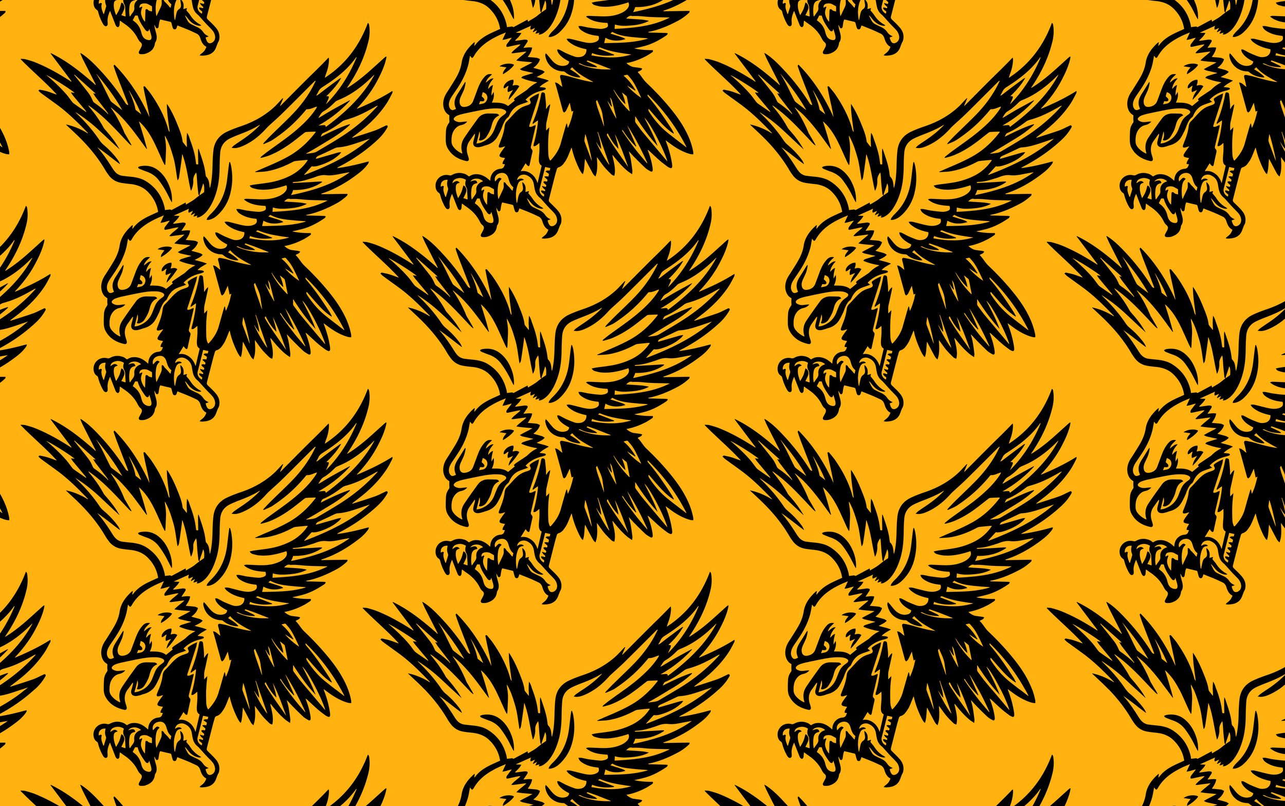
OTHER PRODUCT GRAPHIC EXAMPLES